What about your project was most successful? Explain
I think the commercials turned out really well. It was hard to come up with an idea for Nokia that would be interesting, yet distinguishable at the same time. But once the foundations were laid for the commercials, the rest wasn't too much of a challenge and I think the end result was successful.
What about your project was least successful? Explain.
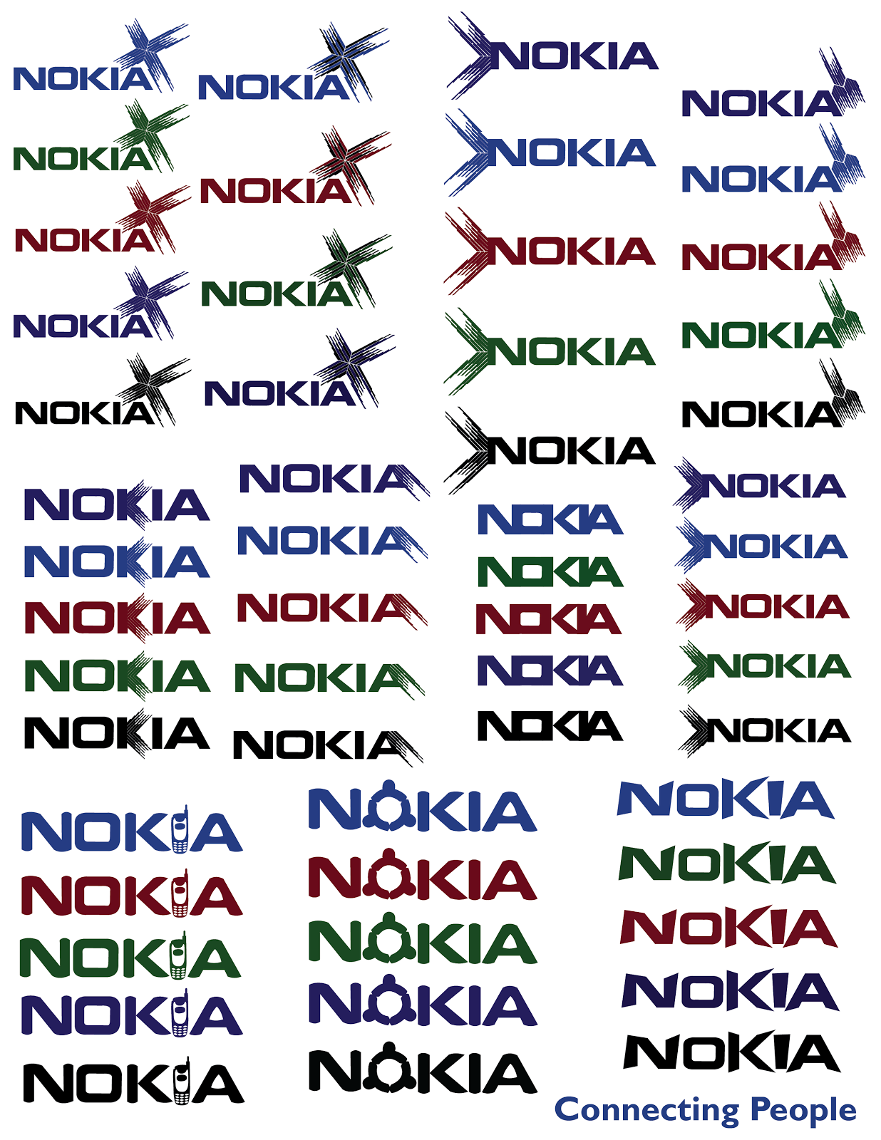
Coming up with 50 logos was definitely the hardest part of the whole project. Not only did I have to come up with 50 logos (which was extremely time consuming), but trying to work with a text based logo was definitely a challenge.
How did you manage your time during the project?
I think I used the provided class time very efficiently. Also, I worked on the project at home as well, since I did have most of the software necessary for the successful completion of project.
What would you change about your work?
Maybe change the Nokia font itself. I was hesitant to change the Nokia font because to me, it seemed like Nokia's signature look. Also, I should have experimented a bit more with ideas for the designs, rather that sticking with the chevron/star design alone.
What mark do you believe you have earned on the project? Explain.
I think my project falls within the 85-90% range. I think the final product turned out pretty well, and although there were some difficulties here and there, I think I'm quite satisfied with the end result.
I think the commercials turned out really well. It was hard to come up with an idea for Nokia that would be interesting, yet distinguishable at the same time. But once the foundations were laid for the commercials, the rest wasn't too much of a challenge and I think the end result was successful.
What about your project was least successful? Explain.
Coming up with 50 logos was definitely the hardest part of the whole project. Not only did I have to come up with 50 logos (which was extremely time consuming), but trying to work with a text based logo was definitely a challenge.
How did you manage your time during the project?
I think I used the provided class time very efficiently. Also, I worked on the project at home as well, since I did have most of the software necessary for the successful completion of project.
What would you change about your work?
Maybe change the Nokia font itself. I was hesitant to change the Nokia font because to me, it seemed like Nokia's signature look. Also, I should have experimented a bit more with ideas for the designs, rather that sticking with the chevron/star design alone.
What mark do you believe you have earned on the project? Explain.
I think my project falls within the 85-90% range. I think the final product turned out pretty well, and although there were some difficulties here and there, I think I'm quite satisfied with the end result.